How Web Design Uses Art as a Base These Days
Everything, at least, is recyclable, or so our society believes. It’s no surprise that art movements find their way into web design. According to the theory, if they were thought to be beautiful when they were created, there is no doubt that they can still attract people today. Because this is the purpose of websites, they are frequently brought back for marketing purposes. But before coming to that, let’s discuss how web design visually appealing – just art, or are there other factors too?
Table of Contents
1. Elements of a Visually Appealing Web Design
1.1 Unique Typography
Most businesses use a specific font or typography to help their customers distinguish them from their competitors. Designers have had greater access to fonts in recent years, making it easier for businesses to express their brands more accurately through typography. When developing your company’s brand, your typography can convey subtle hints about what you stand for. Is your company lighthearted or severe? Is it functional or informative? Whatever font you choose, ensure your designer considers its compatibility across browsers and computers.
1.2 Engaging & Responsive Hero Images
Without the need for text or video, hero images set the tone for your website — the apt image can instantly give visitors a message of what your brand is about, what you do, or what makes you unique. As a result, it’s a good idea to brainstorm hero image ideas and solicit feedback from various sources to determine which image has the most significant impact.
1.3 Background Videos
Background videos are designed to entice visitors from the moment they land on your page. Your visitor will understand the key points about your company without having to read a single line of text.
Furthermore, our brains process video 60,000 times faster than text. People often need to be more open to reading long blocks of text. Still, videos appear to be effortless and can be consumed quickly.
1.4 Flat Design
Flat design helps visitors understand your content faster, and adding depth can bring it to life. Whether you design your website flatly or use shadows and other elements, it is critical to maintaining consistency throughout your website. Ensure that your homepage, product pages, and different key sections of your website use the same design cues so that visitors understand what they’re looking at right away.
1.5 Hamburger Menus
Most websites have extensive menus from which to choose. This benefit is that the menu can direct the visitor to the desired location. The disadvantage is that they typically consume much valuable screen space. This is altered by the hidden, or hamburger, menu. This condensed menu saves space and is easy to navigate for users.
Your website’s pages should have a clear path for the user to follow. By removing the busy navigation, the experience becomes cleaner and less distracting. This makes users more likely to find the information they need to complete a desired action.
1.6 White Space
White space is a popular element in minimalist web design. Still, it is also a critical component of effective modern site frameworks. Users are naturally drawn to crucial aspects of your site when you balance content such as links, text, and videos with similar amounts of white space. While there is no strict rule for how much white space you need, a good rule of thumb is to leave at least some space between each content element.
Partnering with a website design company India is an excellent advantage to any business owner. Choose a web design company that meets all your criteria. Only go for a website design company and Website design services that you can trust. Therefore, it is vital to pick a web design company India that is experienced enough to handle your brand matters efficiently.
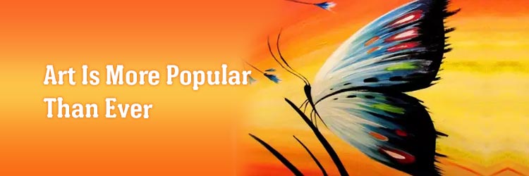
2. Art is more popular than ever
In museums around the world, you can discover new works of art. For several generations, they have been where everyone sees the most beautiful paintings, sculptures, and other pieces of art created over time. This knowledge culture has awakened a larger group to the importance of having skills in our daily surroundings. These days, you can find original art for sale in an online gallery with a few mouse clicks. The democratization of art is complete, which brings us back to our topic of web design copying art.
Art is a must when you eye for good Website design services. Give your nod to a website design company that comprehends the importance of art when offering Website design services. Although nowadays, you can expect a web design company to consider this factor.
3. Using Art Styles to Draw Customers' Attention
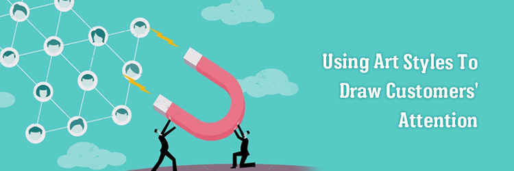
When the vast majority of the population recognizes Andy Warhol’s artwork, it becomes natural to use similar imagery on a website to pique people’s interest. That is an excellent example of what is currently being done in graphic design. They are creating images that will remind people of famous artists or similar ideas to keep the brand in their minds after leaving the website. However, other genres are frequently used. Here are a few examples.
3.1 Midcentury Modern
Although David Hockney is less well-known than Andy Warhol, his signature style, which is part of the Midcentury Modern movement, is undeniably eye-catching. This is why there are so many similar images on websites nowadays.
3.2 Art Nouveau
If you’re looking for something beautiful, look no further than works from the Art Nouveau movement. This style was popular in the late 1800s and early 1900s. When you look at the detail in its drawings and paintings and its distinct style, it’s easy to see why it’s back on websites.
3.3 Abstract Art
Abstract Art’s strength in graphic design is that, while it entices the customer, it does not remind him of any specific object. As a result, it can be used by almost any brand for a wide range of products and services. It’s full of vibrant colors and is the ideal online marketing tool.
3.4 Symbolism
Let us conclude this blog with an art style that has become well-known worldwide due to Klimt’s singular genius. Symbolism is precisely what it sounds like: the representation of something through art, but not how it would appear in real life. Although this is an excellent tool for marketing directors, they will need to collaborate with real artists if their symbolism is to be effective.
4. Conclusion
The most effective websites not only provide their visitors with a wealth of great content, but they have also carefully researched the visual environment in which their visitors will most enjoy consuming that content. While art will always be subjective, if it attracts a more like-minded audience to your website, creative and artistic design is also entirely functional.
Are you looking for a reliable web design company India to offer you fantastic Website design services within your budget range? Your choice should be Matebiz Pvt. Ltd. – the leading website design company India.
FACT TIME!
Did you know that if your site disappoints, nearly 8 out of 10 visitors will bounce, and they will be driven straight into the arms of your competitors?
Almost 79% of people who don’t like what they find on one site will go back and look for something else.
If you’ve worked hard to rank for the keywords and persuade the user to visit your site, don’t let poor design drive them away to the next best thing.

Ezra Kelvin
I’ve been working with Matebiz for the past six months, and it has been an absolute pleasure. I was looking for a freelance SEO outsourcing company to help me with content writing, web design, and social media strategy. But what really drew me to Matebiz was their customer service. We started working together on a trial basis where I became hooked on the speed of their turnaround time and the reliability of their work.
Recent Blogs
-
 Important Steps to Avoid Pitfalls in CRM Adoption
-
 Mobile EMR App Development: A New Era in Healthcare Delivery
-
 How to Get Started With Answer Engine Optimisation (AEO)
-
 What Are Google’s E-E-A-T Principles: Building Trust for AEO Success
-
 How to Choose the Right IT Outsourcing Partner: Key Criteria to Consider

